The Bing Shopping team was going big on increasing the collective DAU (Daily Active Users) across Shopping surfaces in 2021 and that is where the idea of a shopping visual feed was born (with a focus on Shop the Look).
Competitors such as Wish, Instagram, and Pinterest had started promoting their rich visual feeds for shopping.
Bing Shopping team decided to build partnerships with providers & leverage the rich image processing tech we already had to build a proof of concept Shop the Look feed.
I worked as the solo designer on this project with 2 PMs and a team of 10+ developers in the first quarter of 2021. The project was ongoing when I left, but this case study showcases the work of around 1.5 - 2 months.
My task was to come up with a vision of an immersive Shopping feed for Bing Shopping surfaces while also zeroing in on the MVP based on the partner image data that we were getting for Shop the Look. The business direction changed mid-way and the feed had to be designed for MSN.
As the name suggests, the Shopping Feed (that I was working on) was meant to be an immersive, visually rich shopping experience with a major focus on ‘Shop the Look’ feature using which the users could buy the products shows as a part of a wardrobe/environment in the image. The team had partnership with a 3rd party provider to get the product and image data.
The vision behind the Shopping Visual Feed was to create an immersive and joyous experience for the ‘inspiration seeker’ persona and provide meaningful experience across different shopping stages (shown in the diagram below).

Irene is a 26 year old graduate student who is an active social media user and is constantly on the look-out for new fashion trends to try. She turns to Instagram and Pinterest to seek inspiration and often ends up buying products similar to the ones she saved for inspiration.

Making a Pinterest board is a ritual for me before any kind of fashion or home-decor purchase.
I worked with the PMs to define clear value props for the Feed which served 2 purposes:
1. Bring everyone to the same page regarding the top value props the Feed has to offer
2. Treat these value props somewhat like user stories to prioritize and design specific features.


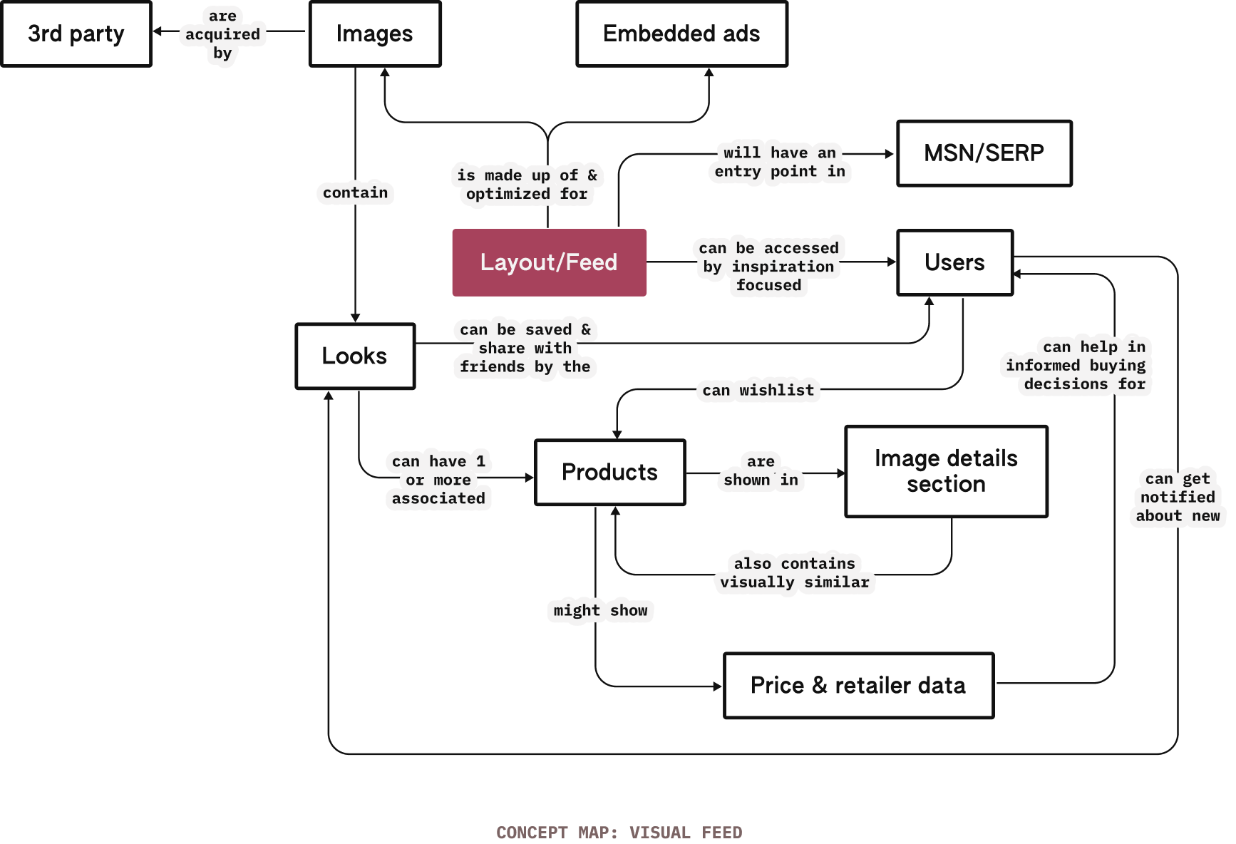
Using the value props defined above, a sketched out a quick (non-exhaustive) conceptual model for the Shopping feed to see what the overall system looks like and, if necessary, make any changes in the overall product/flow.
This also helps me better plan the interface and the design of different components.

Embrace & accommodate variations in content & composition

The feed should captivate users and provide contextual value-props
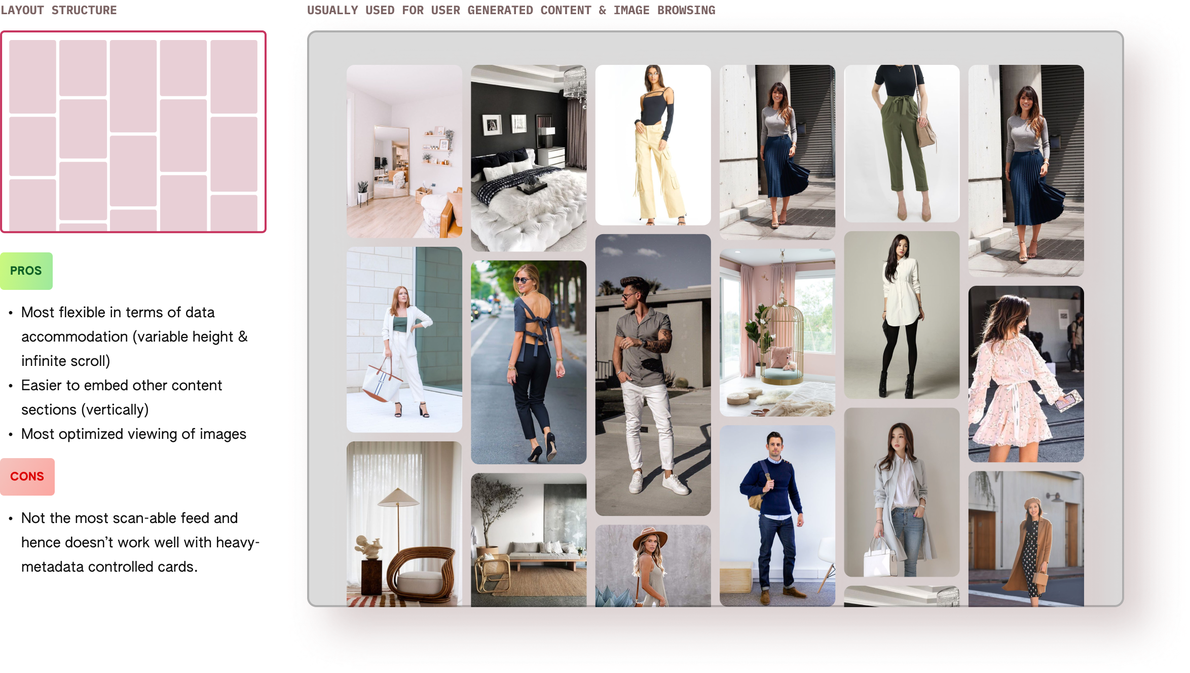
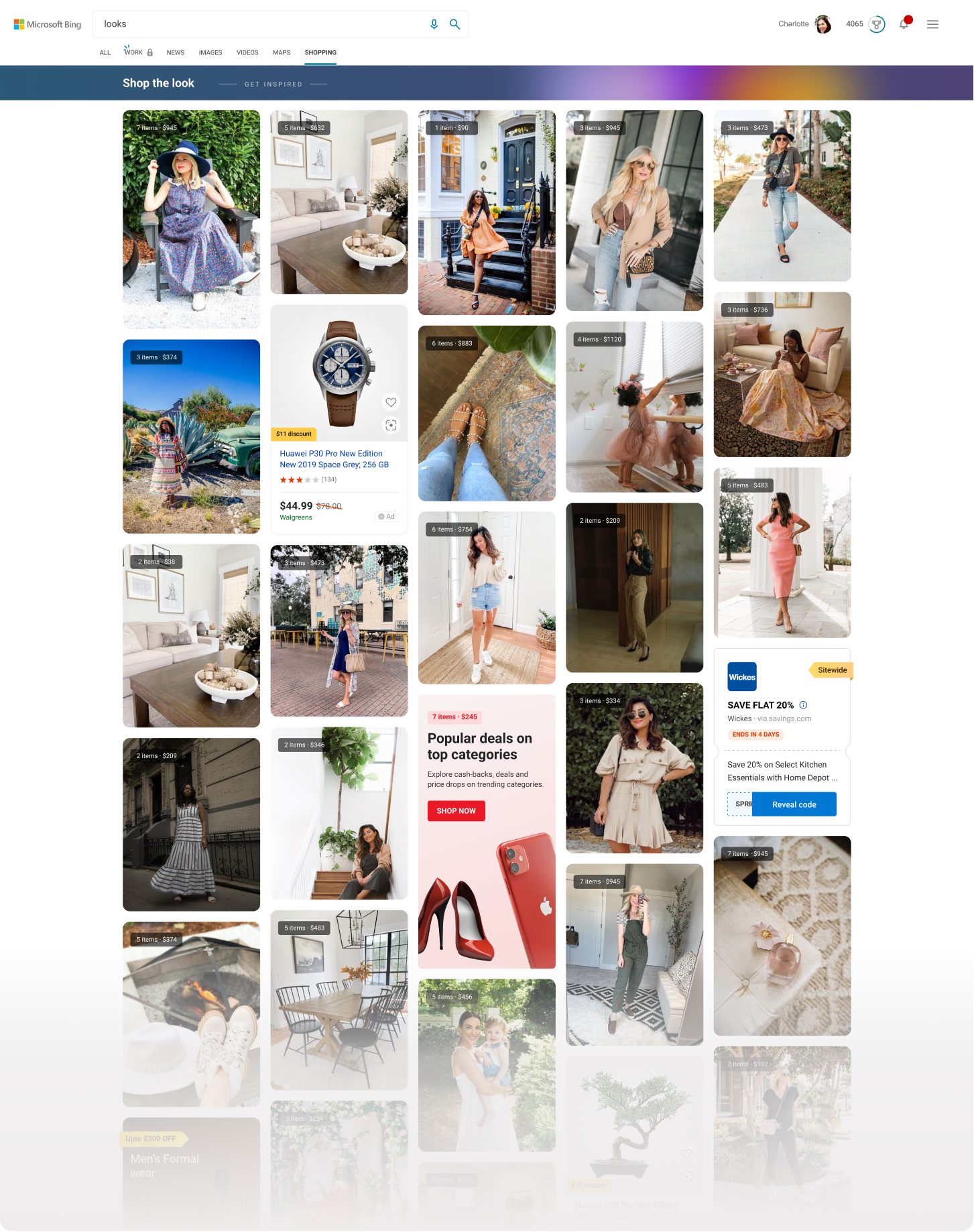
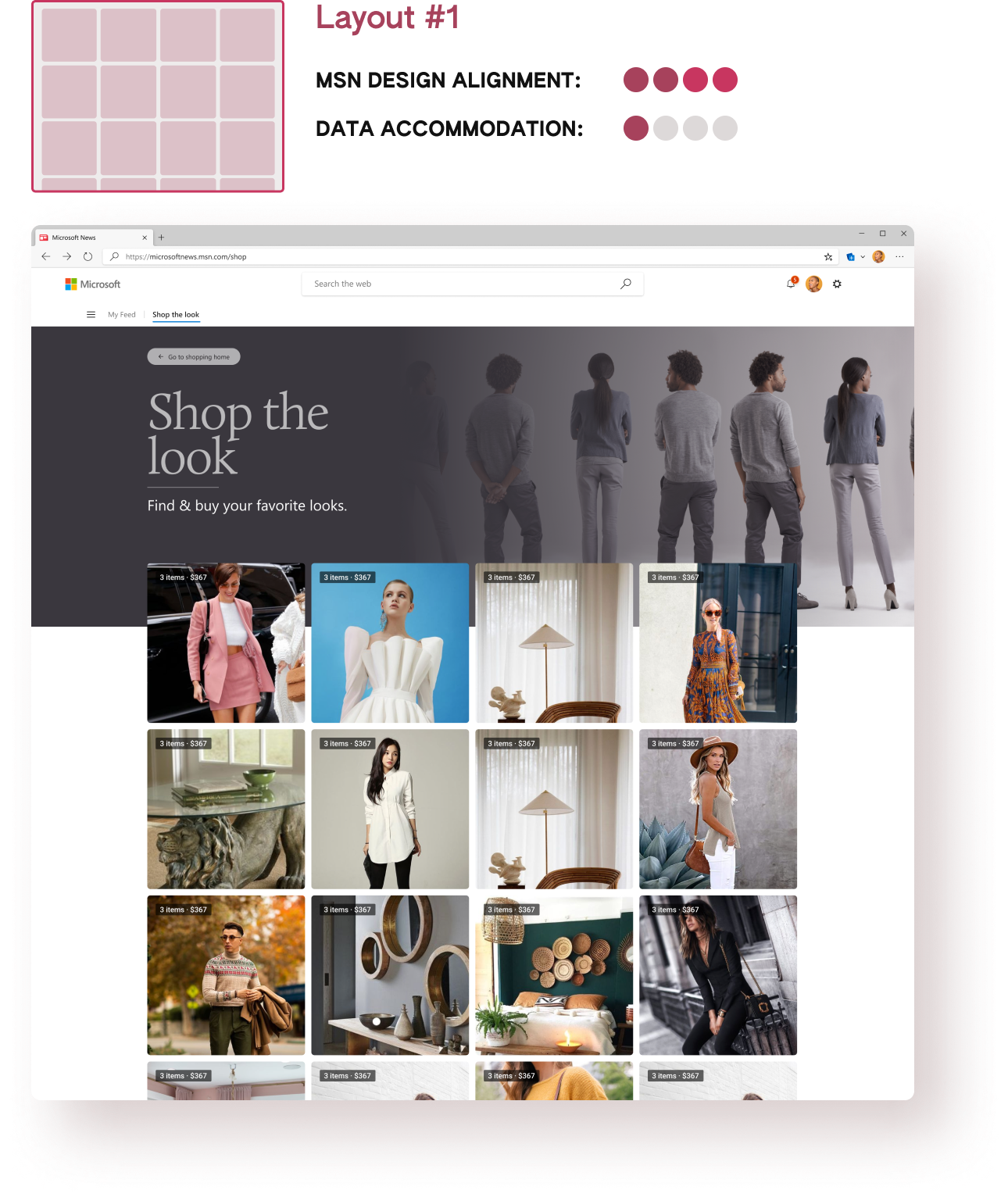
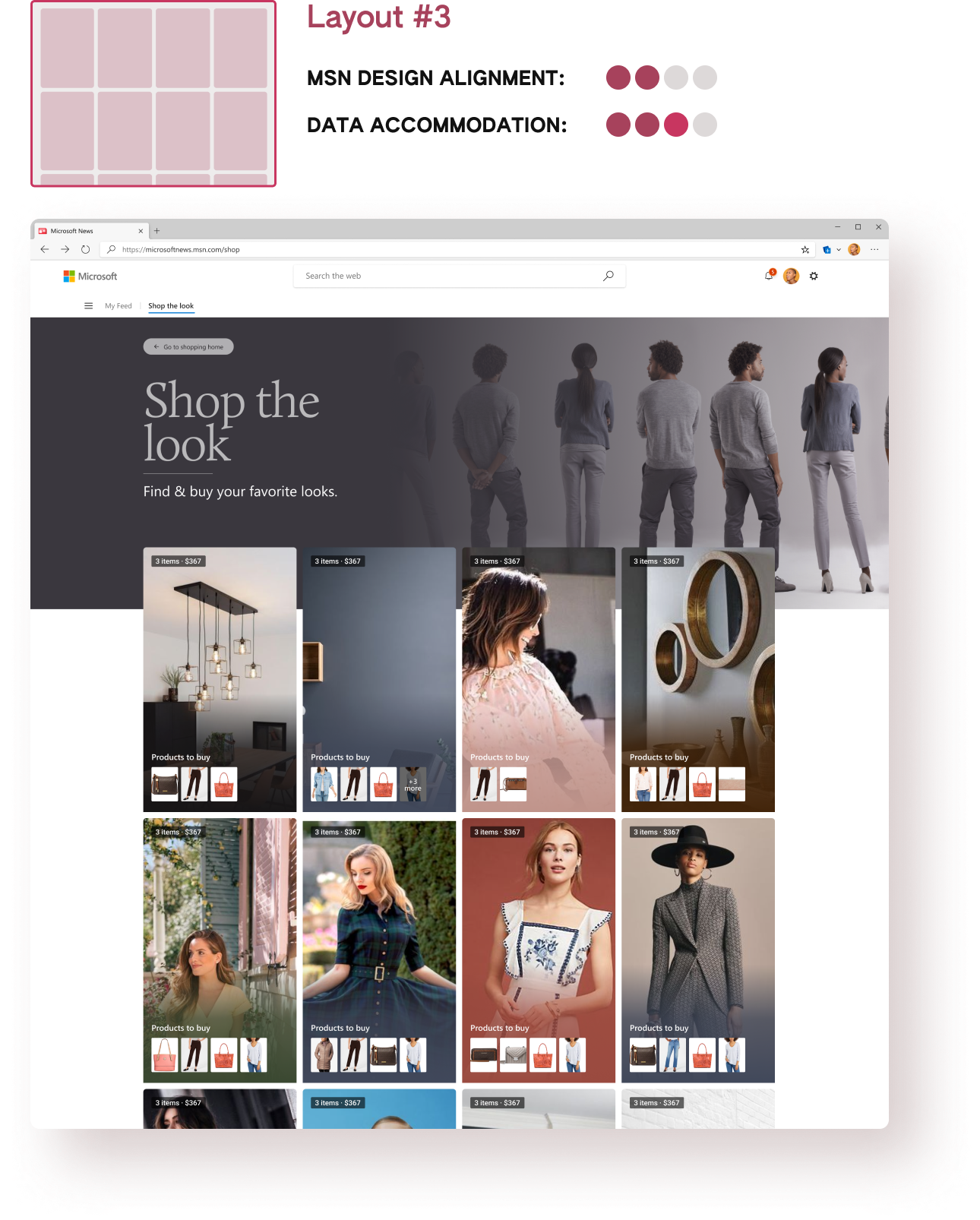
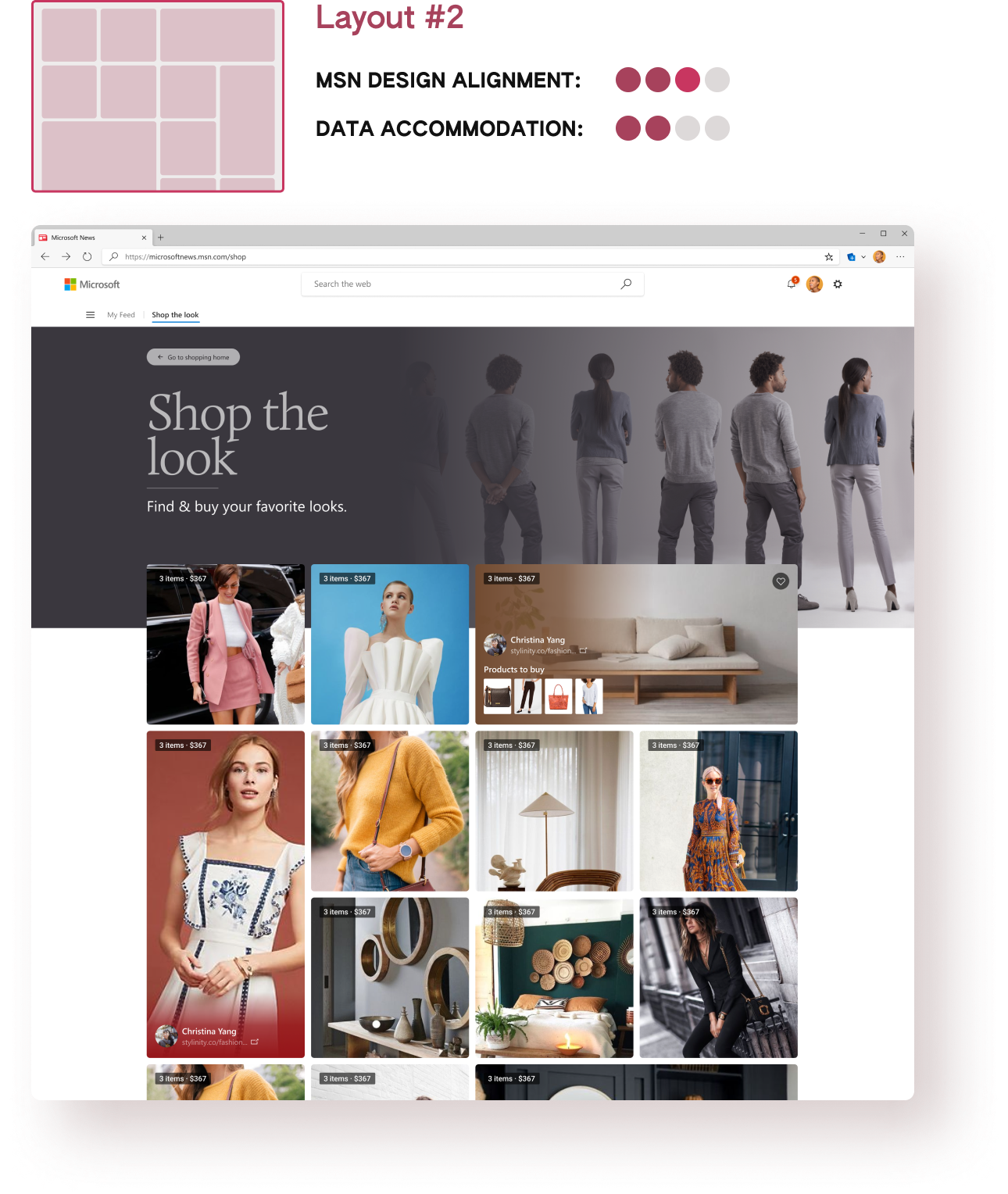
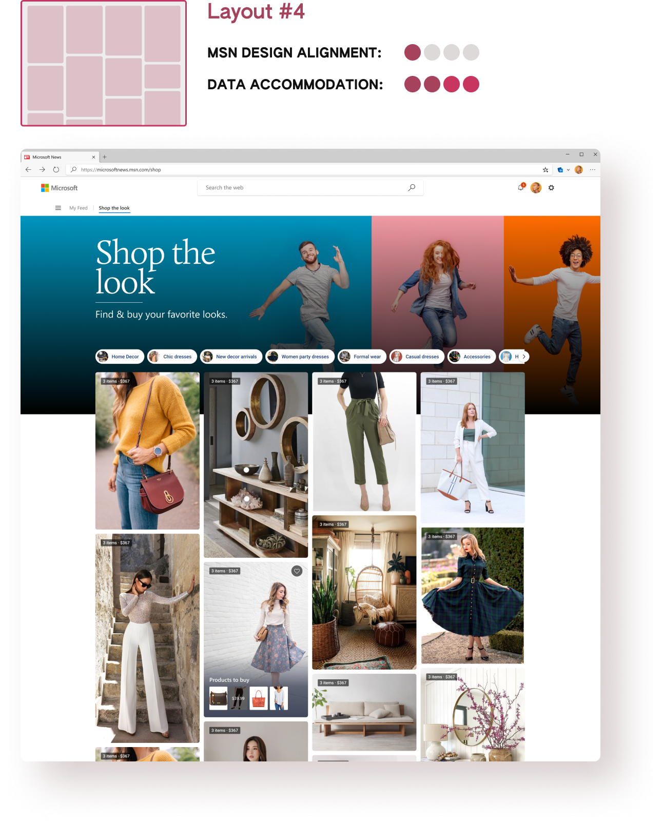
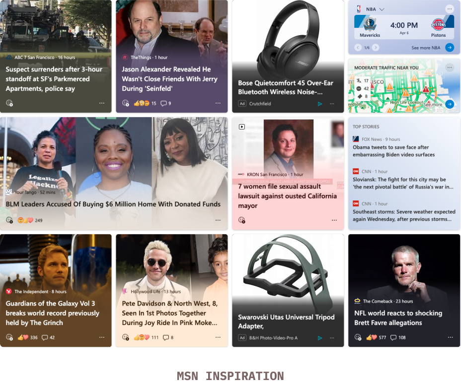
Before I started working on the visual feed, there were some pre-existing design explorations already done by another designer some time back. The explorations were mostly done for the feed itself and, as evident from the concept map above, the layout/feed is (of course) the central element of the experience. Hence, I dived deep into studying the layout structure (shown below).
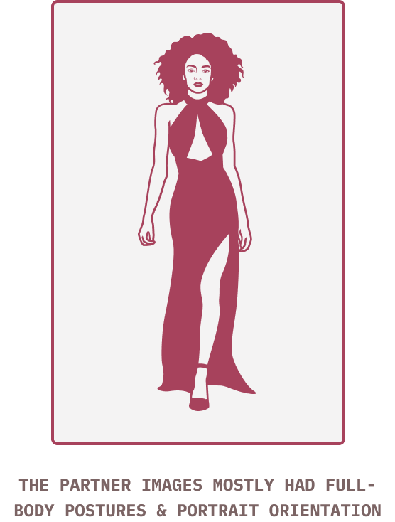
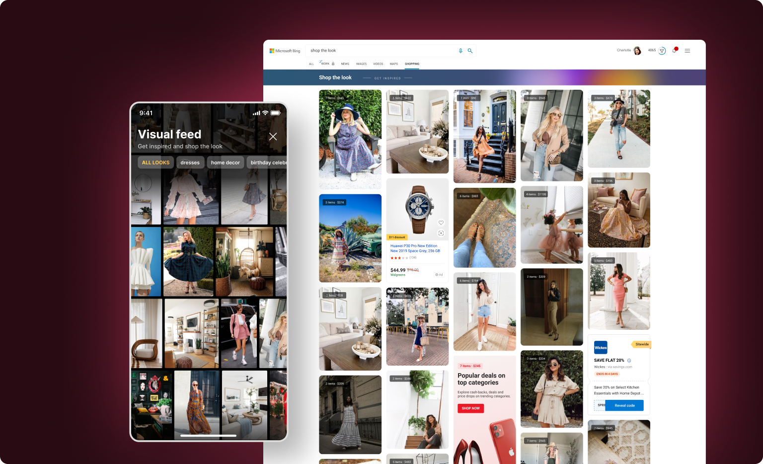
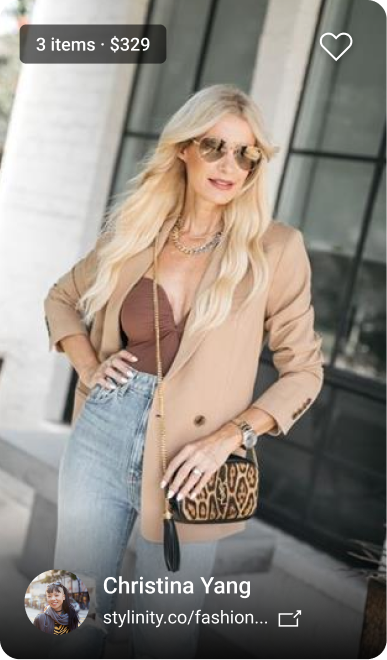
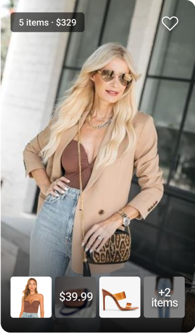
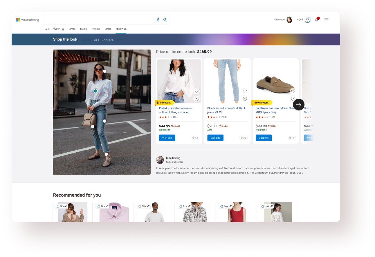
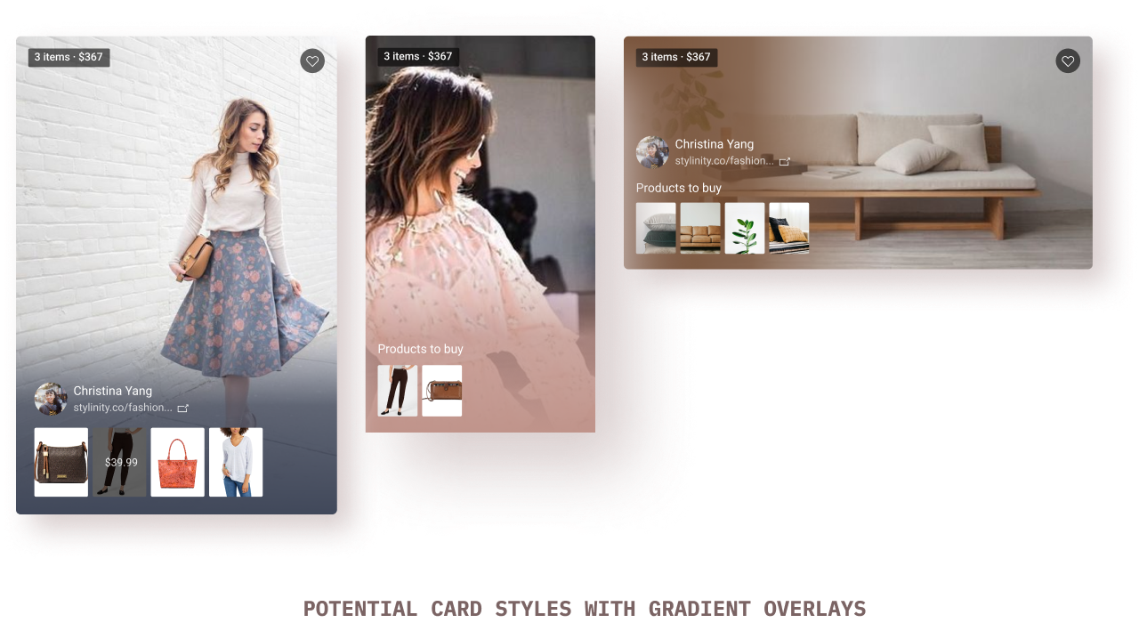
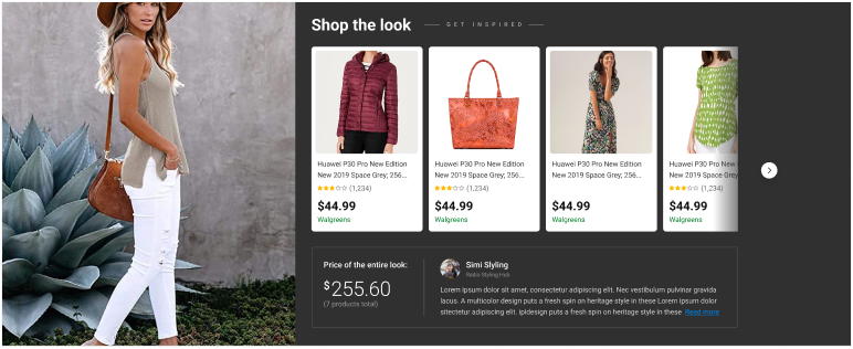
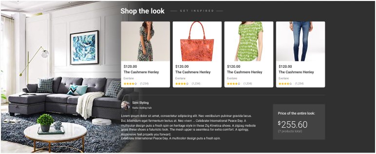
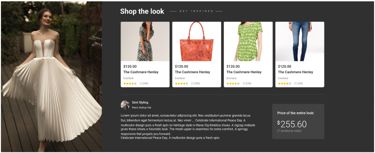
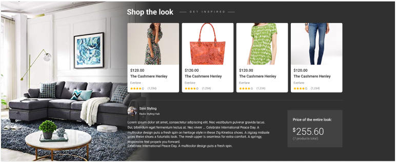
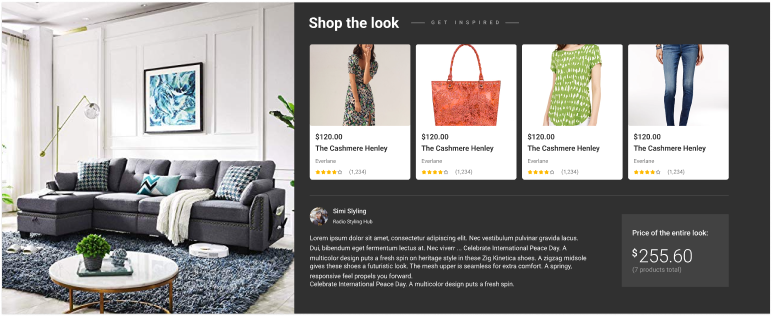
The Shopping team had partnered with Stylinity - an online platform that hosts user-generated ‘Shop the Look’ content which is a combination of images (looks) and associated products that the viewer can buy from the listed retailers.
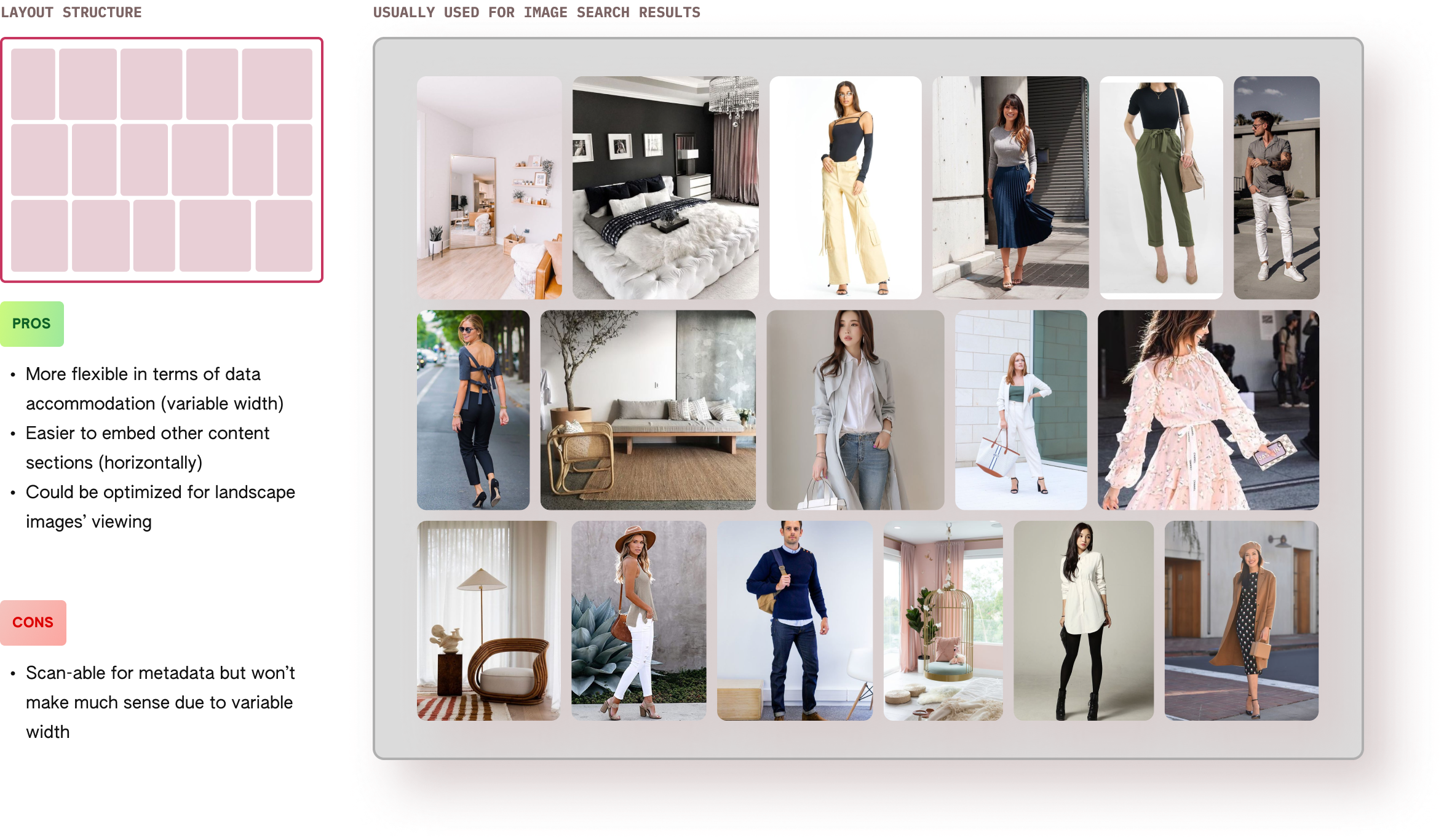
An important things to note here is that most of the images on Stylinity are of people showcasing looks and hence, naturally have a portrain orientation. This data helped in me make 2 decisions:
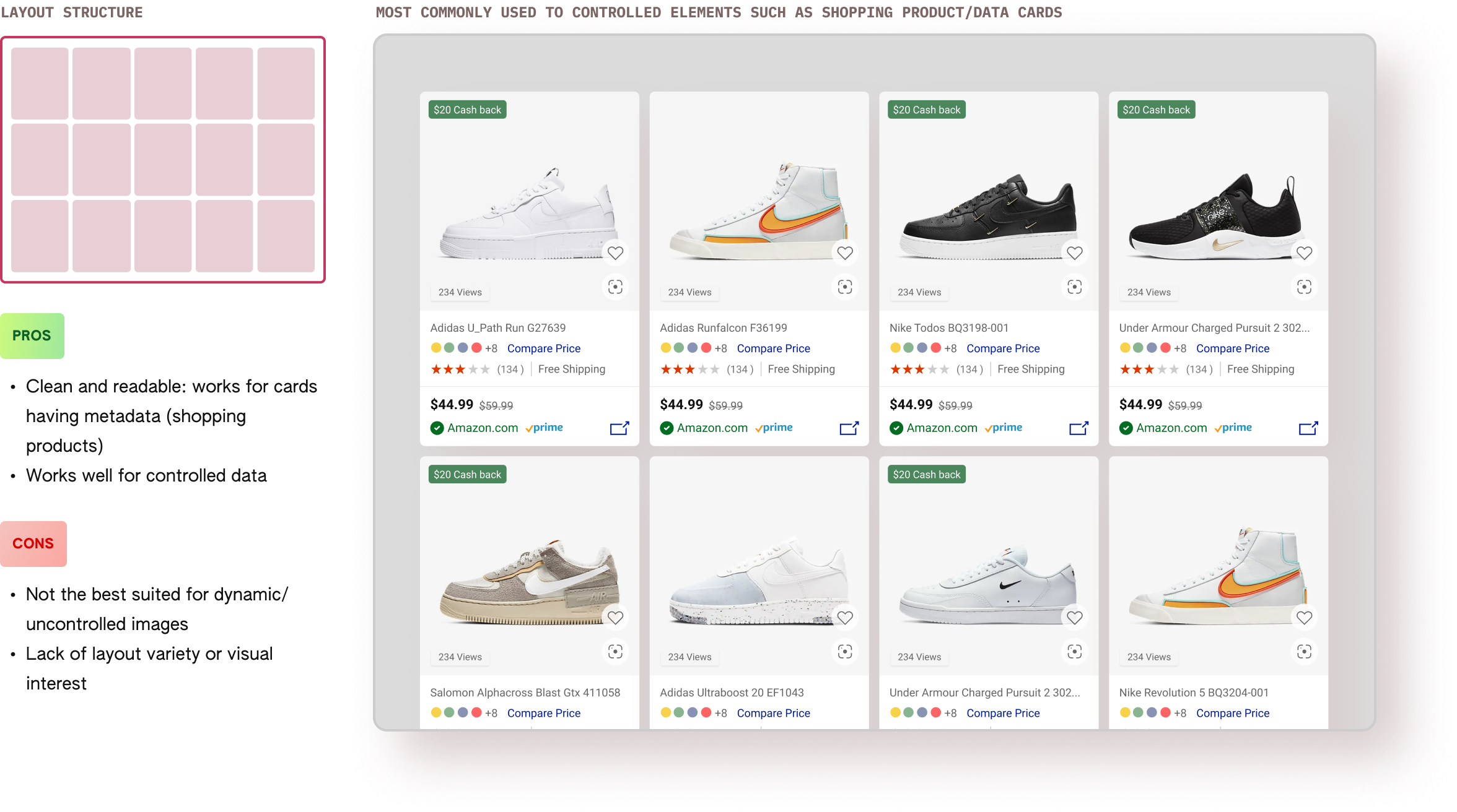
1. Decide the most optimized layout for the data (in this case it was Layout #4 shown above).
2. Width of the image column to show the content in the best possible way for a non-responsive layout.
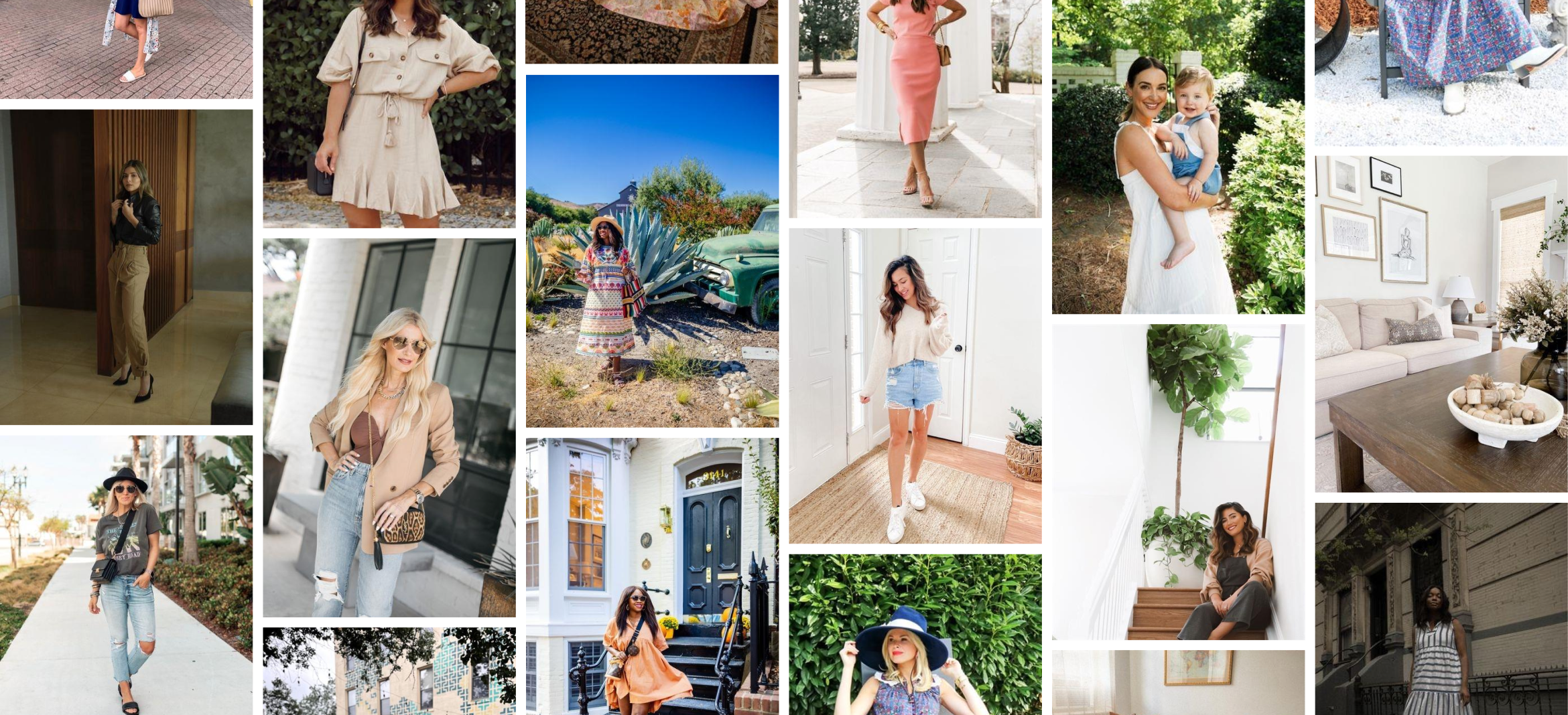
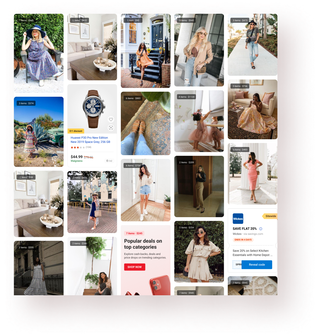
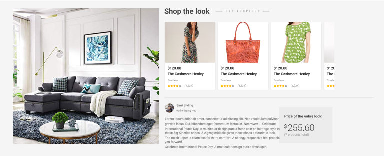
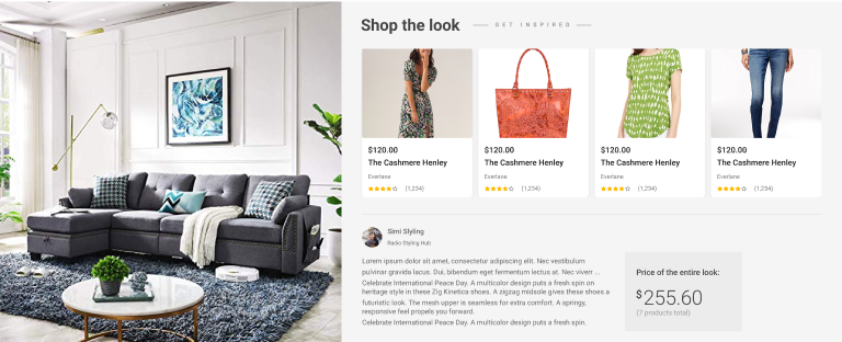
Once I had analyzed the partner data and decided the best layout, it was time to design the individual components, interactions, and putting them all together to build the feed.
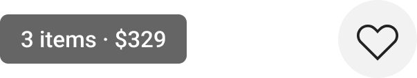
These were the core elements of the experience and I fixed a column width of 232px allowing for 5 columns on a 1366px grid allowing for an optimized viewing experience. I explored multiple hover interactions for the cards keeping PLT (page load time issues) in mind.
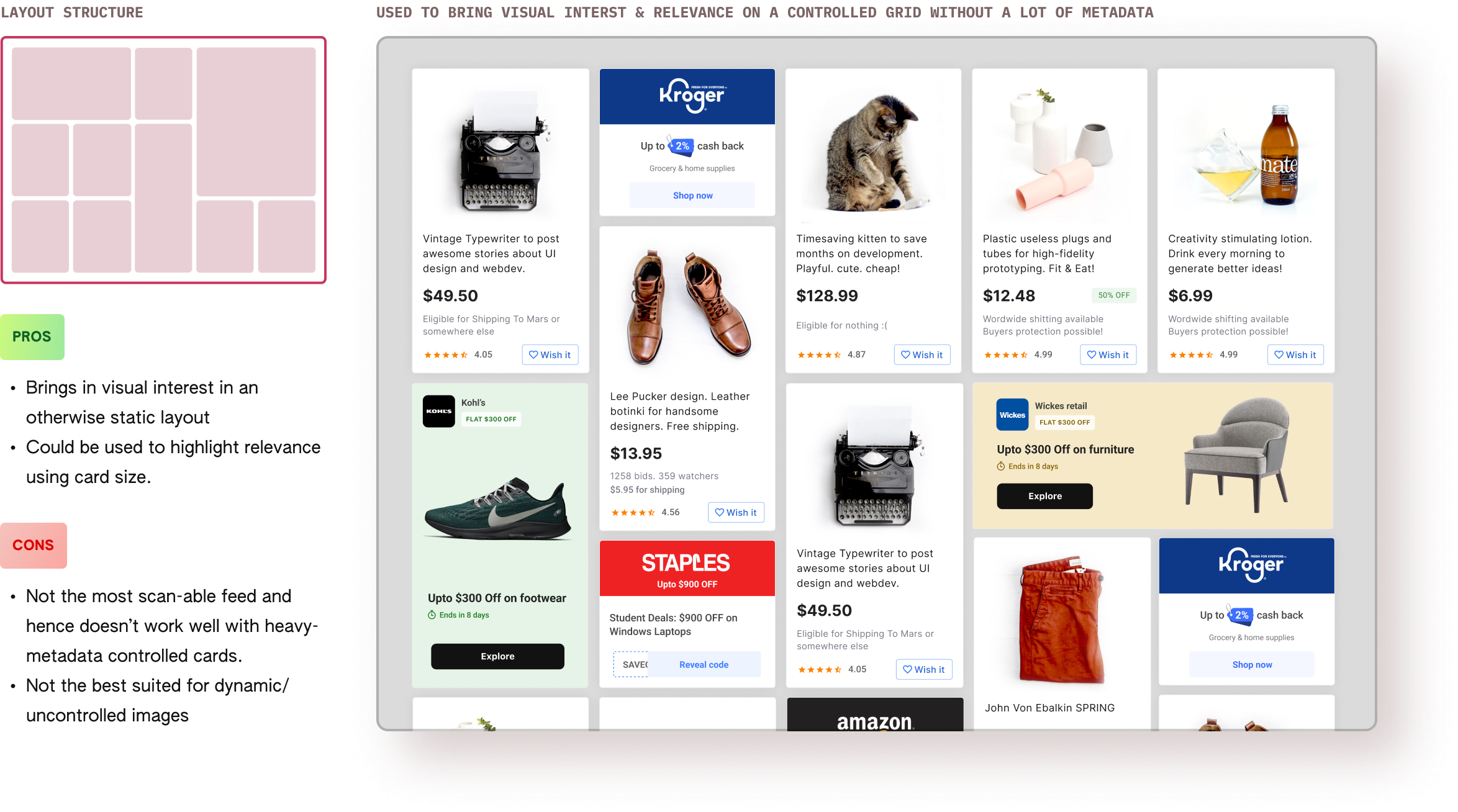
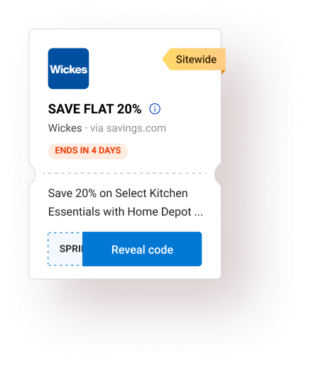
I had a business requirement to fulfill- embed ads & Bing promotions in the feed. This posed a challenge - how many ads and how often should appear on the feed. Since the image size was dynamic, I calculated the avg. no. of images in a single view and finalized no more than 2-3 embedded promotions for every 18-20 images. This was a rough estimate and not a bullet-proof calculation. The goal was to optimize user experience with the business goals.
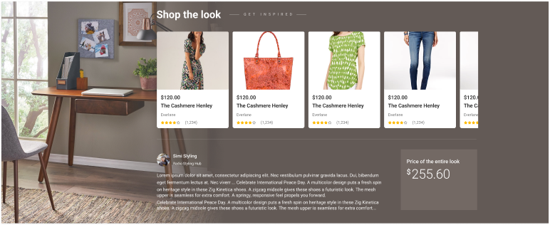
Since the global Bing header (with search & the tabs) had to be there, the goal for the header was to make it stand out without adding too much information. The reason for that was to not distract the users because we were planning to introduce tabs below the header going forward.
At the time of building this feature, we were working with a non-responsive grid which was hard-coded at 1366px width (although it worked on majority screen resolutions for Bing users- shown on the right).

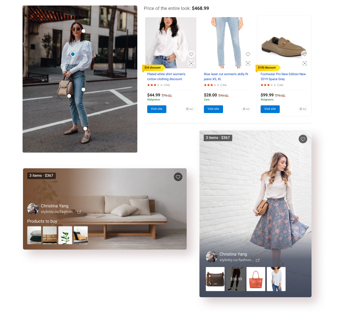
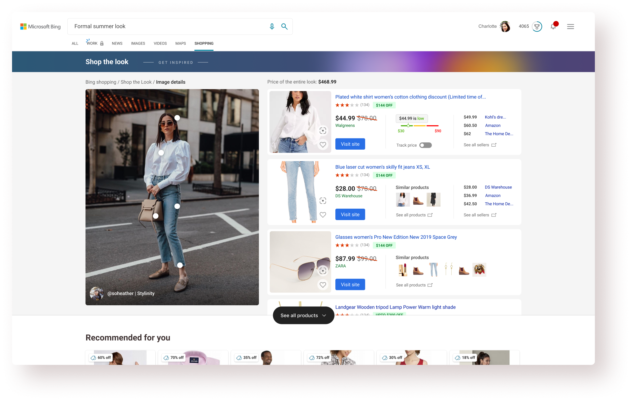
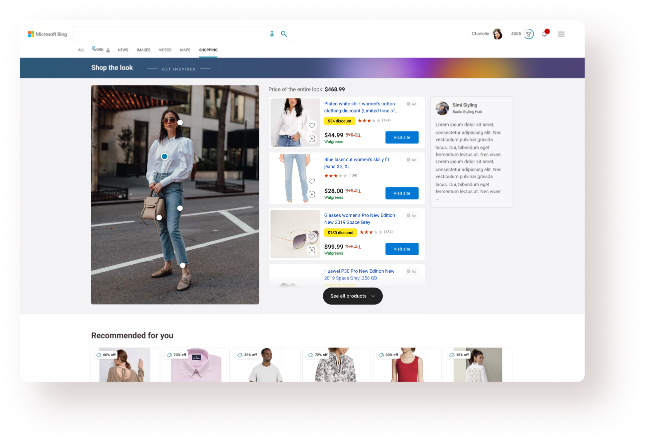
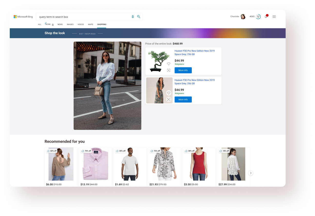
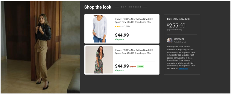
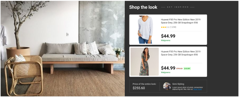
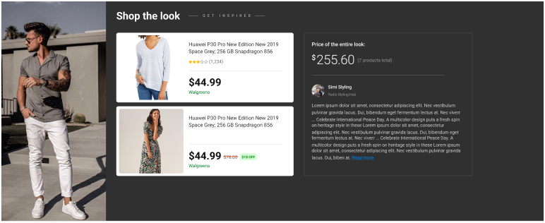
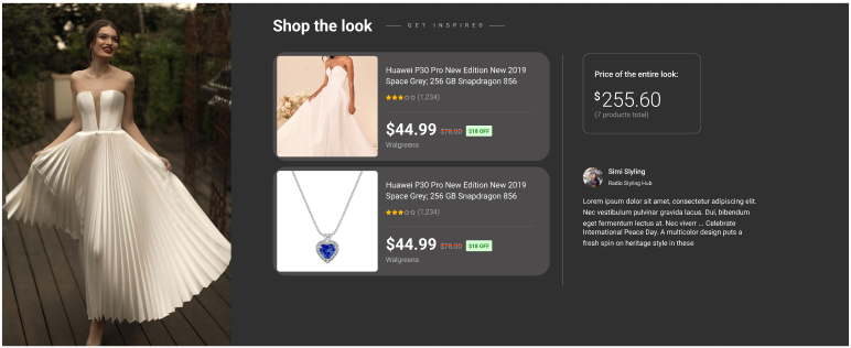
After finalizing the feed design, it was time to build the image details pane - a surface where users can browse the products associated with the selected ‘Look’.
Designing the image details pane was more challenging than the feed itself and took twice the time. Reason being - lots of edge cases and data variation.
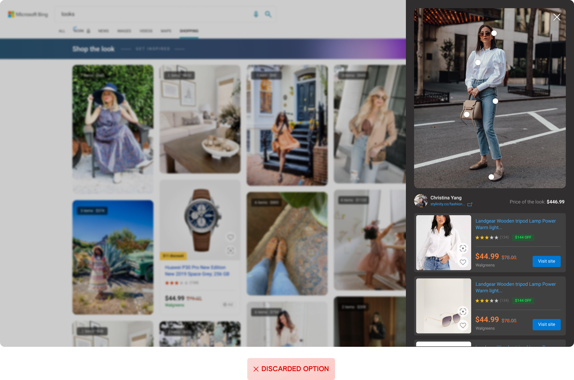
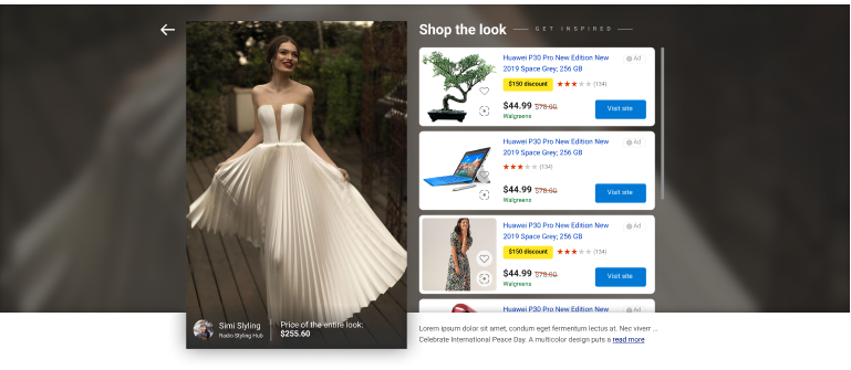
This kind of overlay modal works better when the user wants to ‘quick view’ any look, resulting in efficient navigation through the experience. But this design was discarded because we had a lot more data to show for each product and the overlay wouldn’t offer a chance to show ‘related products’.
The natural choice after exploring the above option was to go for a new page with rich product cards and the first fold dedicated to the selected image. In terms of interactions & layout, there were 2 options: a. Horizontal cards with in-line expansion. Vertical cards with horizontal scroll
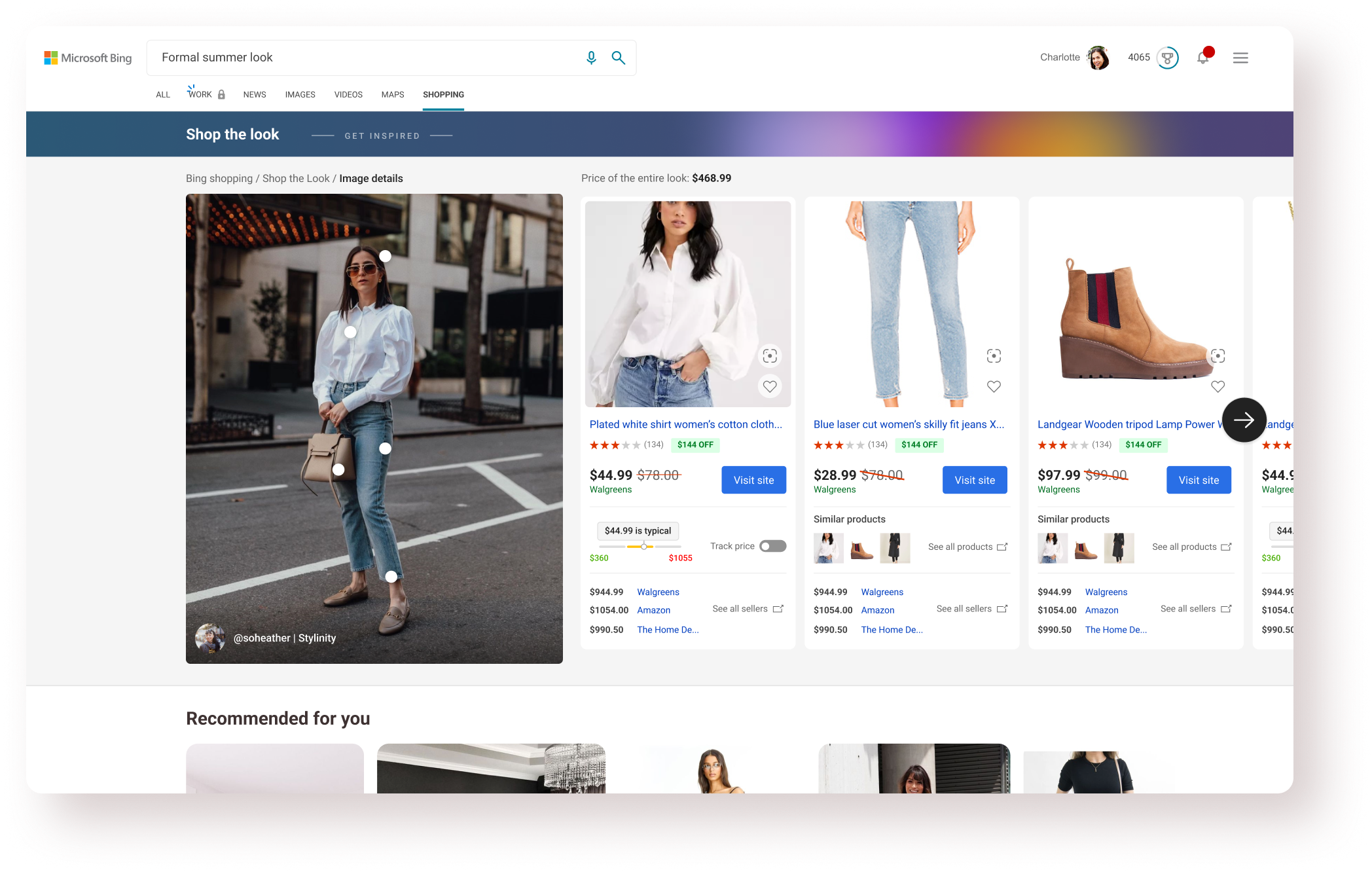
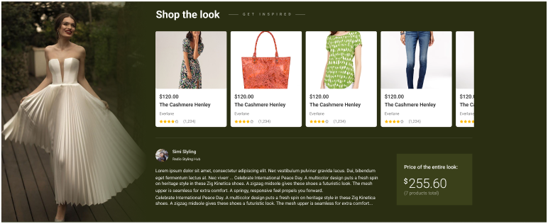
There were many instances with data discrepancies or simply lack of data. For example, a lot of products wouldn’t have the rich price-track/similar products data which would warrant a different product card design. Similarly accommodating different number of cards in the view was a challenge because the looks had 1-12 products. I looked at the distribution (left graph) and optimized the design for the major 3-5 cards. Also proposed a decision to skip looks with just 1 product.

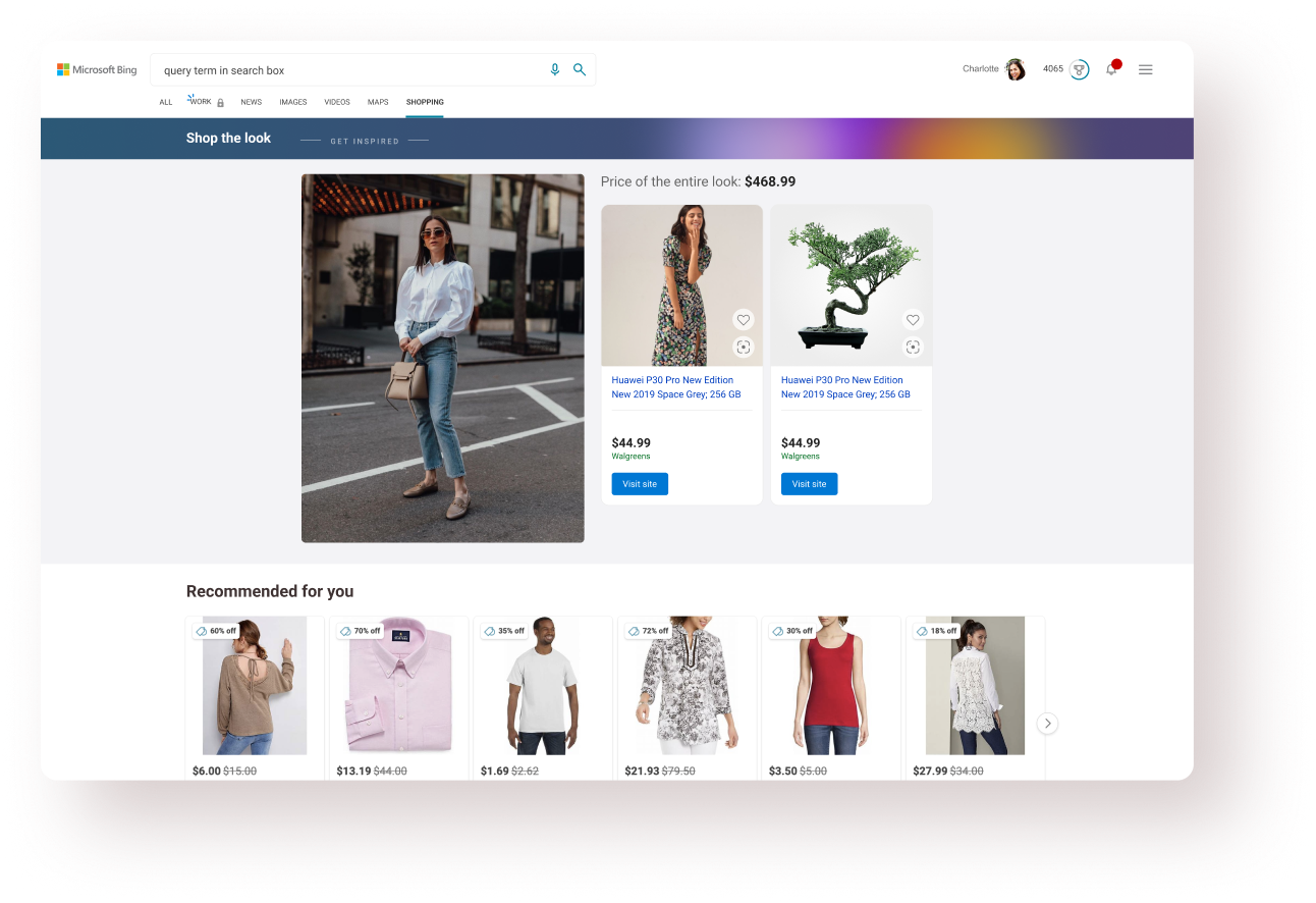
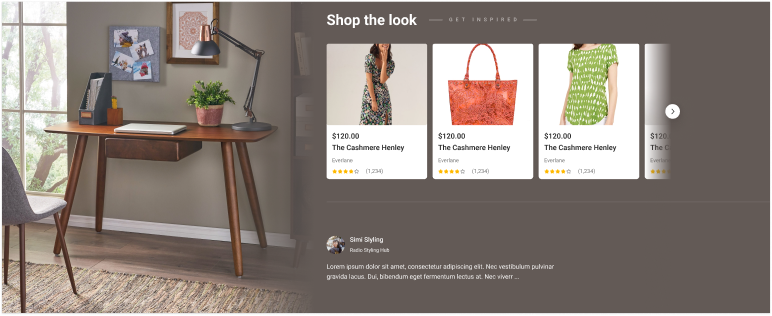
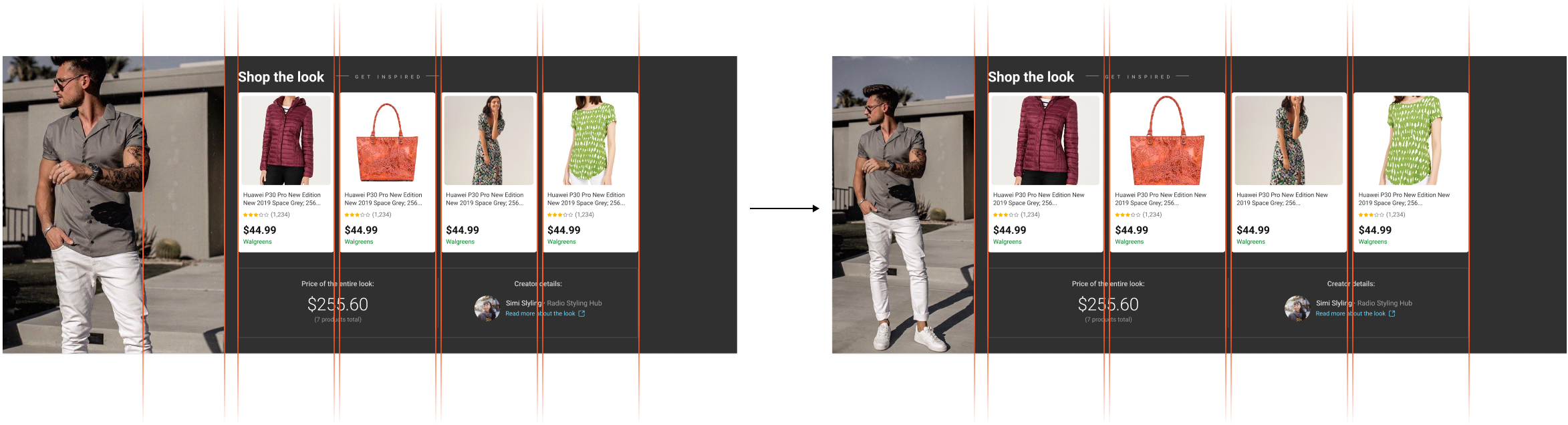
While the Shop the Look feed work was ongoing, there was a change in business direction for the product- the feed will be hosted on MSN first (with super-short turnaround time) and will be brought to Bing later on. This changed a lot of things and I tried to re-purpose the designs for MSN.
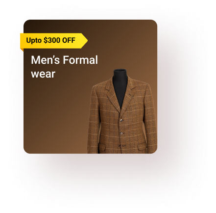
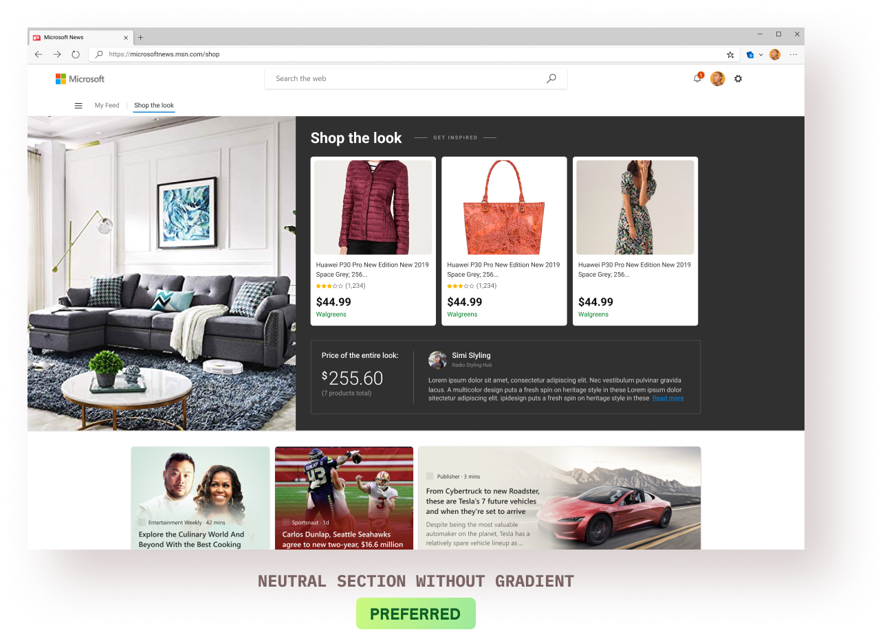
MSN had a distinct 4-column layout for the major experience and we couldn’t make the case to have it changed for this experience. Hence, we resorted to a 4-column layout & explored some variations (below).

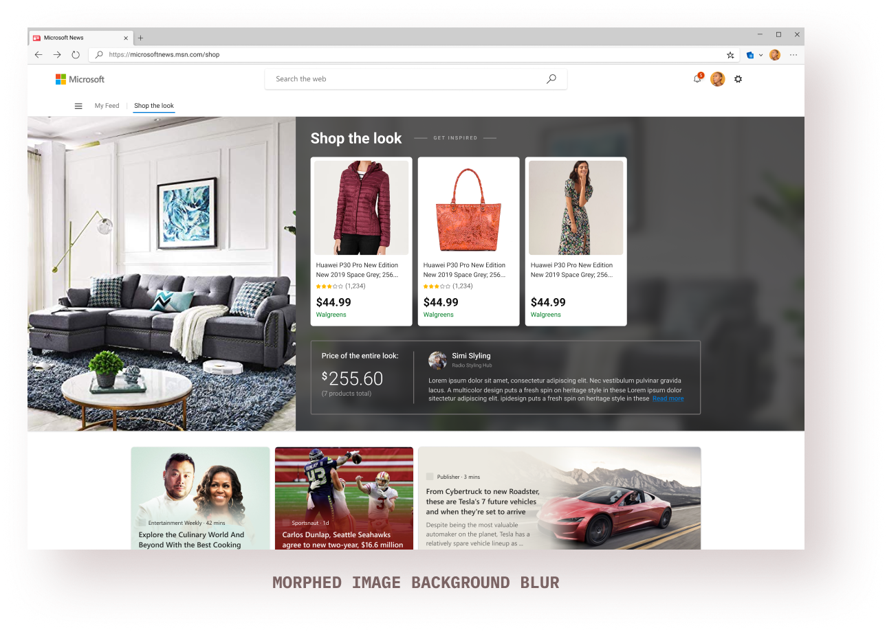
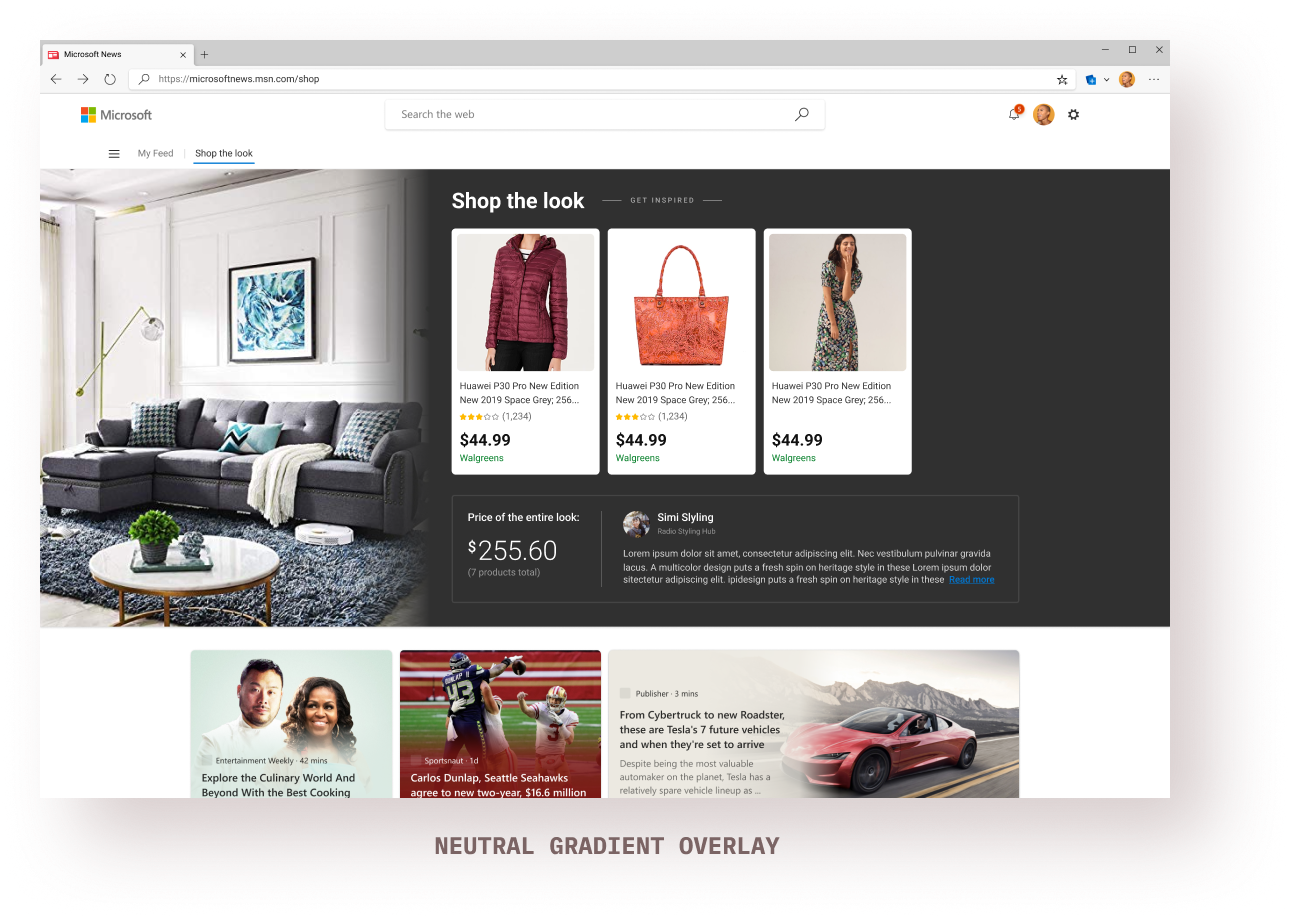
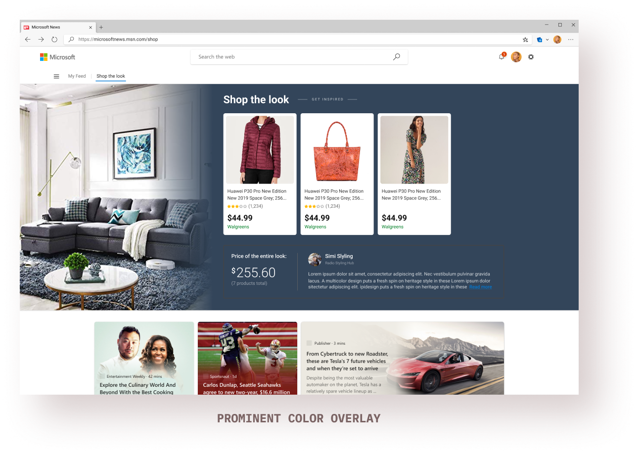
MSN cards use gradient overlays using extracted prominent colors from the card image itself. I decided to follow the same pattern for the feed cards which also changed the hover states.
This again took the maximum time to figure out due to the edge cases. I explored multiple options for gradient/non-gradient patterns, potential edge cases, and implementation time.
I had worked on the Shopping mini-app within Microsoft Start (Microsoft’s newly launched super-app) and tried to design a mobile experience for the feed as an experiment.

The MVP 'Shop the Look' feed was shown specifically to users who were interested in fashion/clothing/inspiration/looks on MSN and the engagement was a satisfactory 1%.
feed impressions every month on MSN
users were actively engaging with the feed every month

The data that we were working with had an absurd amount of variability: the variation in our own data (price history, smart suggestions, etc.) + the variation in the partner data (images & products) made it challenging to cater to all the edge cases.
I decided to stop ‘designing for all the edge cases’ and tried to focus on those cases that’ll affect the majority of the experience. Made all the decisions in collaboration with my product & dev team.

As mentioned above, I started with designing the feed for Bing and the direction changed midway towards building it for MSN. Both are very different platforms with different needs, design languages, and users. I had to revise my feed designs within a very tight time constraint.
I studied the design system and visual language of MSN and tried re-constructing the Bing feed designs to fit within the MSN eco-system. I can’t say that was the best approach because I was mostly reverse-engineering the designs due to the time constraint.

Since this experience is heavily dependent on 3rd-party provider data, basing the designs on a data-type or a provider isn’t sustainable in the long term. I could’ve spent more time sketching out the probable changes in future scenarios and making the design more future-proof.

When the business direction changed towards building for MSN, I got little/no time to understand the true intentionality of the MSN design language. I could’ve spent more time doing that and less time reverse-engineering the designs. Doing a lot of visual design explorations did help me do that to some extent.

I had a lot of discussions with my design team members around immersive-ness and what makes and experience truly immersive. It means different things in different contexts and I wish I could’ve spent more time in understanding what true immersion means in a feed context.